The Rise And Fall Of Empires. On A Map Of Course
One of the things we loose in today's up to date maps on the web and on our mobiles is how things used to be; the temporal problem of digital maps for want of a better phrase. It's not that there's no data on the past, it just doesn't surface very often.
But sometimes the data does surface and then people make maps of what used to be. Take the British Empire for example. When I went to school in the early 1970's there were maps of the world in almost every class room and they were old maps. Whether down to a lack of funding or as a reminder of what Britain used to be, these maps still showed the extent of the empire, in a pale shade of reddish-pink.

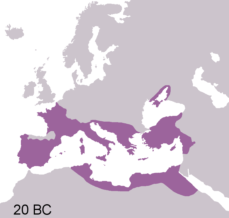
Or there's the growing and then shrinking extent of the Roman Empire, spanning 27 BC through to 1453 AD.

There's a whole load more Empire maps over at io9.com. However nice it is to see maps of the past, I have the same problems with these maps as I did of the maps of the changing boundaries of Europe. A static map or an animated GIF cry out for the modern interactivity of a web map. Looking at the maps above I just want to pan and zoom them and run the timeline forwards and backwards. But finding the geospatial data to do this is no easy thing.
But as a comment on my post on the maps of Europe pointed out, there is some data out there. Maybe when I get back from my summer vacation I'll make the empire maps that I want to see.
Photo Credits: Roman Empire map and British Empire map on Wikimedia.