Right Now

⏳ Waiting for the APIs in the Cloud for what's going on right now ...

The Union Of Subsidized Farmers, Mummy and Slayers Of Virgins - More Mapping Madness

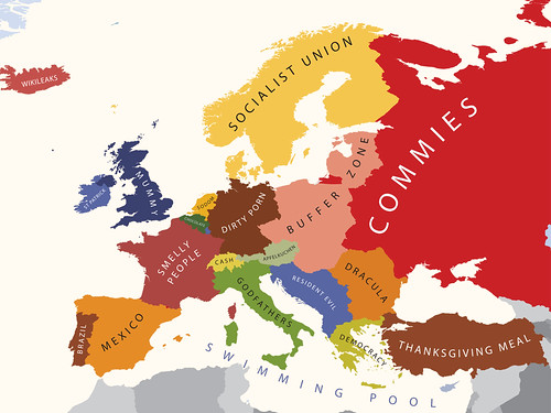
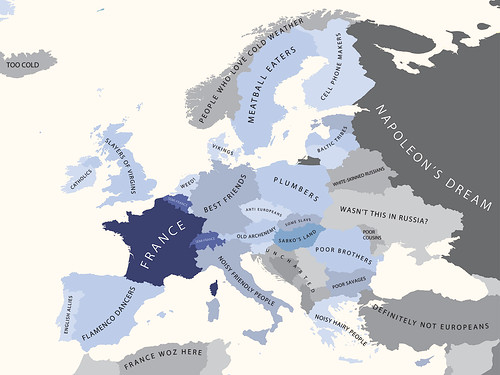
Yanko Tsvetkov, visual artist, graphic designer and illustrator, has been at it again producing more mapping madness and cartographical curiosities. The man behind the map of Europe according to the Hungarians has produced another crop of somewhat subjective maps of Europe, where the United Kingdom comes under the headings of The Union Of Subsidized Farmers (Where I Live), Mummy (according to the USA), Slayers Of Virgins (according to France) and Enigma Code Hackers (according to Germany). Apparently.

Here's a couple of examples; Europe According To The USA ...

Europe According to the United States of America

... and Europe According To The French.

Europe According to the French

Head over to his mapping stereotypes project page for the rest. It's mapping, but not as we know it, and as Yanko aptly puts it, "a sense of humour is highly recommended".

Flight Safe Mode

As part of the security and safety announcement that gets made each time you get onto a plane these days, there's invariably a bit which goes something like this ... "all electrical equipment should be switched off during taxiing, take off and landing and all devices with a flight safe mode should have this enabled now".

This makes sense; in the case of an emergency, the airline wants you concentrating on the emergency, not your laptop or your phone. It may also be the case that the phone may in some way interfere with the flight systems. Opinion on this is divided but the former seems a more realistic option than the latter.

Where's The Map? ... Here's The Map

I'm currently at the Location Business Summit USA in the Crowne Plaza Hotel in San Jose, California where yesterday I gave a talk on "Of Data Silos, Geo-Babel and Other Geo Malaises". More about that in a later post, but one of the points I raised seemed to strike a chord with the audience ... in 2010, where's the map?

In spite of today's joyous rush to location based services and location based mobile services, the map seems to take a back seat, if it's even present at all. This point was taken up again on one of the opening panels with one of the panelists commenting that "many services don't use maps as an interface".

But there are times when the map is precisely the interface you want to use, especially when you're trying to visualize the impact of a data set on a location and serendipitously my morning trawl of my RSS feeds provided two examples of where the map is and just how effective it can be.