This Interactive Sandbox Allows Users to Make Topographical Maps in Real-Time
Today's maps found on the interwebs. 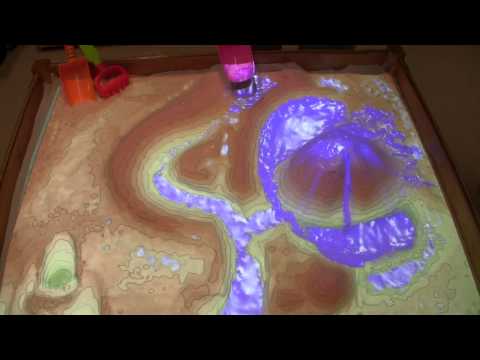
Water moves in predictable ways across undulating landscapes, but it can be hard to appreciate from a human perspective on the ground. It’s much easier to understand when you’re essentially a giant hovering over the land with the ability to move mountains and make rain.
Found at https://www.atlasobscura.com/articles/make-topographical-maps-in-a-sandbox