When Maps and Data Collide They Produce ... Art?
Last month I wrote that a map says as much about the fears, hopes, dreams and prejudices of its target audience as it does about the relationship of places on the surface of the Earth. With the benefit of hindsight I think I was only half way right.
Sometimes a map becomes more than just a spatial representation and becomes something else.
Sometimes a data visualisation becomes more than just the underlying data and almost takes on a life of its own.
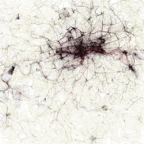
When these two things meet or collide the results can be spectacularly compelling and produce, unintentionally ... art? Look at the image below ... filigree lace work? Crochet for the deranged of mind? Silk for the sociopath? Macrame for the mad? Sadly none of the above.
It's instead an image from the Geotagger's World Atlas but it's still unintentionally beautiful.
The maps are ordered by the number of pictures taken in the central cluster of each one. This is a little unfair to aggressively polycentric cities like Tokyo and Los Angeles, which probably get lower placement than they really deserve because there are gaps where no one took any pictures. The central cluster of each map is not necessarily in the center of each image, because the image bounds are chosen to include as many geotagged locations as possible near the central cluster. All the maps are to the same scale, chosen to be just large enough for the central New York cluster to fit. The photo locations come from the public Flickr and Picasa search APIs.
I could look and stare at the all the images in Eric's Flickr set for hours. Correction, I have stared at the images for hours.
Photo Credits: Eric Fischer on Flickr.
