Maps, Maps And MOAR Maps At The Society Of Cartographers And Expedia
Updated September 13th. 2012 with embedded YouTube video.
Wednesday September 5th. 2012 was a day of maps. To be precise, it was a day of maps, maps and MOAR maps. Two events, two talks, back to back. Packed choc-a-bloc full of maps. I also cheated slightly.
Firstly there was the International Cartographical Association's first session of the newly formed Commission on Neocartography. Cartography, neocartography, maps; what is there not to like? I'd previously spoken at the UK's Society of Cartographer's annual conference so it was great to be asked by Steve Chilton, SoC and Neocartography chair, to speak at the Neocartography Commission.
For a change, the talk title and abstract I gave Steve didn't vary during the usual researching and writing of the talk.
`Content-Type: text/plain; charset=us-ascii Mime-Version: 1.0 (Apple Message framework v1278) Subject: Re: Neocartography workshop X-Universally-Unique-Identifier: d1c70302-eaba-4132-80fb-f74eb1de2347 From: Gary Gale In-Reply-To: DEC2FCE18B20734CAFA668E438482963834F621862@WGFP-EXMBV1.uni.mdx.ac.uk Date: Fri, 20 Jul 2012 14:13:39 +0100 Content-Transfer-Encoding: quoted-printable X-Smtp-Server: mail.vicchi.org:redacted Message-Id: BEB576E2-3E8C-4136-803A-0CE5E5456C26@vicchi.org To: Steve Chilton
Actually, I'm going to change the title ... what I'd really like to see up on the web site is this ...
Title: History Repeats Itself And So Does The Map Abstract: Steve Chilton says this just MIGHT be interesting; you'll have to take his word for this
... but that might not work. So try this for size instead
Title: History Repeats Itself And So Does The Map Abstract: History has a habit of repeating itself and so does the map. From primitive scratchings, through ever more sumptuous pieces of art, through to authoritative geographical representations, the map changes throughout history. Maps speak of the hopes, dreams and prejudices of their creators and audience alike, and with the advent of neogeography and neocartography, maps are again as much art as they are geographical information.
... will that do?
G`
But then, no sooner had I got one event for that Wednesday when fellow Yahoo! alumni and now Expedia developer and chief evangelist Steve Marshall asked me to team up with ex-Doppleran and ex-Nokian Matt Biddulph at Expedia's EAN World of Data event which was cunningly masquerading as a BBQ that very Wednesday evening. So I cheated. One day. Loads of maps. Two events. But one talk. Only time will tell whether I got away with it or not.
My talk at the Neocartography workshop was filmed and you can watch it below, if you like that sort of thing. Personally I hate seeing myself on video, it's even more excrutiating than hearing myself on audio.
[youtube=https://www.youtube.com/watch?v=mSRWy9kMf00]
As usual, the slide deck, plus notes are embedded below, also if you like that sort of thing.
[scribd id=105081787 key=key-28dj39ezex1j55yczevw mode=scroll]
Slide 3
So, hello, I’m Gary and I'm from the internet. I’m a self-confessed map addict, a geo-technologist and a geographer. I’m Director of Places for Nokia’s Location and Commerce group. Prior to Nokia I led Yahoo’s Geotechnologies group in the United Kingdom. I’m a founder of the Location Forum, a co-founder of WhereCamp EU, I sit on the Council for the AGI, the UK’s Association for Geographic Information, I’m the chair of the W3G conference and I’m also a Fellow of the Royal Geographical Society.
Slide 4
Most of my talk have a lot of links in them and sometimes I see people rushing to take a note of them if they see something they think is interesting. You might want to do this too, but don't ...
Slide 5
... this is the only URL in the entirety of this talk you might want to take a note of. It's nice and short and easy to scrawl down. Although if you go there right now, it'll just take you to the home page of my blog, but sometime tomorrow or the day after this is where this slide deck, my notes and all the links you'll be seeing will appear.
https://vtny.org/kk Slide 6
It's also fair to say that this talk is something approaching a personal first. When I'm asked to give a talk, I'm usually asked for a title and an abstract some 3 or so months before the talk. That's also a long time before I actually start writing the talk.
Slide 7 / Slide 8
... but this time, not only has the talk title stayed the same, the abstract still fits and it's even the talk I set out to write, and I have the email to prove it.
Slide 9
But enough about me. Let's set some context. We live in a connected world of interwebs and mobiles. Some of you probably know of this thing on the interwebs called Twitter which has hashtags to identify common themes. A popular hashtag is for people who like to take photos of their food. They use the hashtag #foodporn.
Slide 10
Well I take photos of maps and there's lots of maps in this talk. You could say it's pure unadulterated #mapporn and I make no apology for it.
Slide 11
But before I talk about today's maps, I want to set a little historical context.
Slide 12
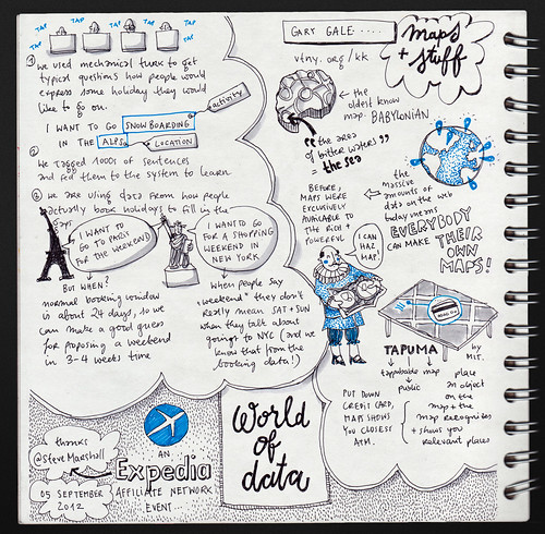
This is one of the earliest maps we know of, of the world as the Babylonians thought of it. Babylon is in the centre of the map and there's seven triangular islands, 3 of which are missing due to damage, in the "river of bitter water", or the sea. To me, the Babylon map is both art, hope and inspiration for the unmapped areas of their world and the best attempt of the age to be authoritative.
Slide 13
Fast forward several centuries to the "golden age of exploration" and while maps are more recognisably accurate, they're still art. But this art came at a price. You needed to be wealthy to commission such a map and such a map was often given as a notional gift to the rich and powerful to curry favour.
https://www.flickr.com/photos/normanbleventhalmapcenter/2675672726/ Slide 14
Furthermore maps were state secrets; sharing maps was sharing power and influence. The entrepreneurs of the time were the great navigators like Columbus and Magellan, their sponsors were kings and countries; their business plan were maps.
https://www.flickr.com/photos/normanbleventhalmapcenter/5385389984/ Slide 15
But maps don't just have to be geographically accurate. They can show data as well. This 1869 map by Charles Minard shows the losses suffered by Napoleon's army in his 1812 Russian campaign. Beginning at the Polish/Russian border on the left, the thick pinkish band shows the size of the army as they advanced towards Moscow. The thinner black band shows the ever decreasing size of the remains of the army as they retreated in the bitterly cold winter.
https://en.wikipedia.org/wiki/File:Minard.png Slide 16
Another type of not necessarily geographically accurate map are the familiar mass transit and metro maps that you probably all recognise, all descended in some shape or form from Harry Beck's iconic map of London's Tube system.
Slide 17
And then, there's the map that most people of my generation will find immediately familiar, the Ordnance Survey map, from the printed version of the pink LandRanger series of maps through to the online version still found at certain zoom levels on streetmap.co.uk.
Slide 18
And no far too quick resume of maps would be complete without the maps we use on an almost daily basis, from Nokia ...
Slide 19
... from Google
Slide 20
... from Bing
Slide 21
... and from OpenStreetMap. All of these are pretty much authoritative, geographically accurate and cartographically pleasing to the eye. But from the maps of 16th and 17th centuries to today's web and mobile maps, there's something missing. There's some brilliant cartography at work but the art seems to have gotten lost somewhere along the way. Or has it?
Slide 22
This map of where I live, using the Watercolor style from San Francisco based Stamen, is as geographically accurate and authoritative as the maps from Nokia, Google and others, but to my mind this is most definitely art. It also happens to be my second favourite map.
Slide 23
So how did we get here ...
Slide 24
... how did we get from cuneiform impressions on a baked mud tablet ...
Slide 25
... to a watercolour style map that, if allowed, I'd want to hang on my wall in a large as possible size as I could get.
Slide 26
I think the answer is data. Lots of data. Easily accessible data, either in bulk or through an API, either free and open or licensed and proprietary. We now have access to the raw spatial data that was previously the preserve of the professional cartographer alone. People can start to make their own maps, their personal, subjective, art maps in ways never previously possible and they can do this because they want to and just because they can.
Slide 27
We can make maps, not only of what is and of what was but also of what might have been but which never came to pass, such as this map of what Berlin would have looked like if Albert Speer's plan for the city had been realised and if the events of 1945 had been very different from what is in our history books.
https://mypantsareonfire.tumblr.com/post/30302438119/albert-speers-new-berlin Slide 28
There's also a flip side to all of this though. Just because we can make maps from all of this wonderful data we now have doesn't always mean we should make maps, such as this gem from the Ottawa Sun which manages to put Saudi Arabia in Africa, puts Iran on the Arabian Peninsula where Saudi Arabia should be, overlooks the fact that the Sudan is now two countries and gets Malaysia and Indonesia confused.
But the topic of bad maps is another talk entirely, so let's get back to good maps. With access to the underlying spatial data and to other data sets with a spatial element, we can now make maps which provide insights into mapping the unmappable. Some cities have formally defined neighbourhoods, London doesn't. But Tom Taylor's Boundaries took a spatially correct map and mashed up Flickr's Alpha data set to show not where London's neighbourhoods are, but where people think the neighbourhoods are. Which may not be 100% accurate but it's a darn sight better to have a notion of where London's neighbourhoods are than no notion at all.
https://boundaries.tomtaylor.co.uk Slide 30
Then there's this map. Definitely one to be filed under the category of "maps because we can", at first sight this map just looks like the US, with lines joining up the notional centroids of each State. Until you start to play with it in a web browser
Slide 31
And all of a sudden you can start to see what would happen if you decided you really didn't want California, Florida or Texas to be where they currently reside. You can play with this for hours. I did. When I really should have been finishing this talk.
https://mbostock.github.com/d3/talk/20111018/force-states.html Slide 32
The more data sets that people produce, the more people can and will make maps with them, so if you'd ever had a yearning to see where people have discovered fossils, for example, then there's a map to show you that. You can argue that this is nothing more than a classic Web 2.0 style maps mashup, but give people a spatial data set and they'll make a map out of it and sometimes that's good enough
https://earth-base.org/fossils Slide 33
But sometimes people will go several steps beyond a maps mash up and produce something which is only just recognisable as a map and is much more about the data visualisation. Like plumegraph.
https://plumegraph.org Slide 34
Here, the map is relegated to a small piece of digital canvas on which the data is projected. But it's still a map, it's still accurate and even if the data being visualised is part of humanity's less attractive side, it's still visually gorgeous. It's still a map.
Slide 35
Now people sometimes make the mistake of assuming that all of this data we're making maps out of is a relatively recent thing. But long before we had the convenient label of "Big Data", organisations such as the NOAA were creating data sets you could make maps out of, we just didn't make the maps until now. So now, we can have temporal as well as spatial maps, such as the tracks of US tornados over the last 56 or so years ...
https://uxblog.idvsolutions.com/2012/05/tornado-tracks.html Slide 36
... or hurricanes over the last 160 or so years. This map is a particular favourite of mine as it subverts the usual mercator projection we tend to see on maps and instead takes a bottom up approach, with Antartica as the focal point, so we can see how these great storms circle around our planet.
https://uxblog.idvsolutions.com/2012/08/hurricanes-since-1851.html Slide 37
Staying with the theme of wind for a moment. This map shows the realtime wind patterns over the United States. Or at least what the wind patterns were on August 31st, when I took this screen shot. It's a nice classic example of a data map. A visualisation of wind patterns. A key of wind speeds. Nothing particularly special. Until you see the realtime aspect ...
https://hint.fm/wind/ Slide 38
... and suddenly the map comes alive. It moves and almost breathes. As with a lot of today's map visualisations, it's oddly compelling and draws you in.
Slide 39
And now, to coin a Monty Python phrase, for something completely different. We're used to seeing maps in Geradus Mercator's map projections. The first maps we see, often at school, or in an atlas at home, tend to be in this projection. It's easy to forget that this is how maps have been projected since 1569. But if you've seen any of the stunning NASA images of our planet as seen from space, you'll probably have noticed that a Mercator map doesn't look like our planet does from space. The map is distorted to fit the projection. Antarctica is this long white smear along the bottom of the map. Greenland is around 60% bigger than it really is.
There's other map projections. Buckminster Fuller's Dymaxion map is one of my favourites. It makes a bit more sense if you rotate it through 90 degrees.
https://www.bfi.org/about-bucky/buckys-big-ideas/dymaxion-world/dymaxion-map Slide 40
There's no projection distortion. It shows our planet almost as a single island in a massive ocean. There's no splitting of the continents. As Buckminster Fuller put it "the maps we use still cause humanity to appear inherently disassociated, remote, self-interestedly preoccupied with the political concept of its got to be you or me; there is not enough for both".
https://www.westnet.com/~crywalt/unfold.html Slide 41
There's just one more map to go but before I get there, I wanted to look a little bit ahead to where maps might go if you could interact with them with more than just a finger on a touch screen or a mouse or trackpad on a laptop.
What about putting a boarding pass on a map and it would show you where in the airport your gate is. What about putting a mobile phone on the map and it would show you where you could charge it. What if you could put a credit card on a map and it would show you where a bureau de change or an ATM is? MIT's Media Lab have done just this with TaPuMa, the Tangible Public Map. Maybe this is the next generation of intelligent, interactive maps?
https://www.youtube.com/watch?v=l4bz9shk8UU Slide 42
So this is the part of a talk where it's traditional to start to wrap things up and to maybe pontificate where we go from here, or what's going to be happening in a year or so's time.
Sadly, I can't do that. As more and more data becomes available, more and more people are making maps from that data in ways we can't even think of right now. All I can say is that making maps is becoming more and more democratised and while we'll always need formal and authoritative maps, we also have the ability to make our own maps and that ability is becoming easier and easier with each passing month.
Slide 43
And as an example of this democratisation of the map in action, I'll leave you with my personal favourite map, again from Stamen, called Pretty Maps, which seems to be an excellent name as this is definitely a map and it's definitely pretty. Will this be my favourite map in a year's time ... only time, maps and data will tell.
Slide 44
I hope you've enjoyed seeing these maps, as much as I've enjoyed researching them. Thanks for listening.
Photo Credits: Eva-Lotta Lamm on Flickr.