Posts categorised as "blog"

2010 - A Year In Numbers

Here in the UK we track the passage of the days, weeks, months and years according to the Gregorian calendar and it's now less than 48 hours before the monotonically increasing number that is the year clicks over to 2011. Of course, whilst widely used, the Gregorian calendar isn't the only type of calendar in active use; 2011 will also be 5772 for followers of the Hebrew date, 1433 for the Islamic date and 1390 for the Persian date. That's not taking into account the Mayan Long Count, the Bahá'í date or UNIX epoch. But I digress.

2010's been quite a year for me and as the remainder of this year slowly ticks away, it's time to wrap up the past 12 (Gregorian) months. But rather than the usual write up, I thought I'd indulge the inner geek in me and review the year in number form, which, in no particular order, looks something like this.


The Delicious Debacle And My Dependence On The Cloud

About 6 months ago, when I announced that after 4 years I was leaving Yahoo! to join Nokia I wrote ...

So whilst I’m going to Nokia, I’ll continue to use my core set of Yahoo! products, tools and APIs … YQL, Placemaker, GeoPlanet, WOEIDs, YUI, Flickr and Delicious. Not because I used to work for Yahoo! but because they’re superb products.

That's still true but the recent news of the closure, or shutting down, or selling off of Delicious has been one of those significant events that makes you sit up and take notice. In this case, it's made me take notice of just how much I rely on the vague and nebulous technology we call the Cloud.

The Geography Of Talking

Apart from being a damn fine Trance album, German DJ Paul Van Dyk's The Politics of Dancing would definitely make my top 5 list of album titles, if I had one. I love the way the two normally diametrically opposed ideas of politics and dancing are used together to make something new.

Here's another example which is much more geo related; the geography of talking.

A group of researchers have redrawn the map of Great Britain using human interactions, in this case people talking to each other on the telephone, to show how little the way in which we communicate and the relationships we have bear any resemblance to the formal boundaries that governments draw on a map. In the map below, the total amount of talk time is shown, with the maps areas being more opaque the more calls and interactions are made.

A Hotel Bath Robe Too Far

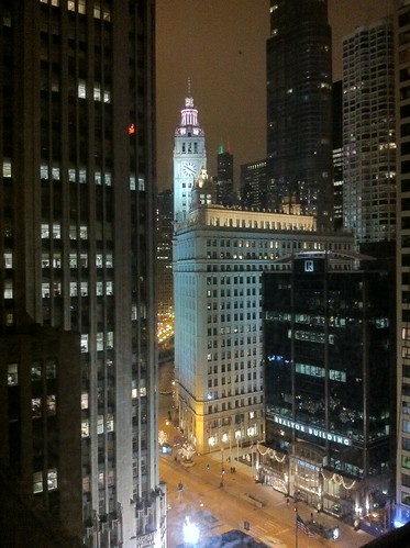
This is the ninth "through the window" type of post I've written and is definitely the last for the year. It's the view of Atlanta's Midtown skyline, from the Palomar Kimpton hotel, late at night, after everyone's gone home and just the buildings and lights remain. There's something completely compelling to me about these night time scenes; maybe it's because you just don't tend to see views like this in and around London.

Atlanta Midtown Skyline

But this isn't the main reason for this post. This post is about hotel bath robes. You know the sort of thing, a generally white, toweling affair that nice hotels provide for you, together with a helpful notice that a large sum of money will be added to your hotel bill should you feel compelled to take the robe home with you. The Palomar, which is a nice boutique sort of hotel, has these bath robes. But in no way can they be classified as white or in any way ordinary. Oh no ...

A Hotel Bath Robe Too Far

.. there's also a tiger skin effect number hanging up in the wardrobe in case fake zebra skin isn't your style. You'll hopefully be relieved to hear that I just couldn't bring myself to put either of them on.

Society of Cartographers Redux

To be filed under the "slightly self promoting" department, earlier this year I was invited to speak at the Society of Cartographers Summer School in Manchester, UK. It's always great to be invited to speak at a conference but I was particularly excited by the SoC. The geo world I inhabit is one of data, APIs, platforms and data mining and aggregation techniques. Sometimes the map gets lost in all of this. So it was an honour to speak at an event where it was all about the map. The Summer School was written up in November's edition of the SoC Newsletter which is only available to society members, but with permission I've reproduced below the sections of the newsletter which cover my involvement.

Visualising Twitter's Geotagged Tweets

You might have noticed but I'm a reasonably big Twitter user. Actually, I should be more precise. I'm a reasonably big Twitter API user ... I tend to use Tweetdeck on my mobile devices and on my laptop. I very rarely use Twitter on the web, and so I've only just noticed how Twitter are handling the display of geotagged Tweets. Take a look below and you'll see that on the accompanying map that they're rolling up from the point of the geocode to the nearest administrative geographic entity and highlighting this in a rather fetching shade of transparent red.

Paleo vs. Neo - A Final Word (Plus A Helpful Venn Diagram)

When you're on the inside of an industry looking in, you take a lot of things for granted. You fling terminology, acronyms and slang around, safe and secure in the knowledge that your audience knows exactly what you're talking about. But when you're on the edges of an industry, or even on the outside, looking in, all of a sudden that terminology becomes opaque, those acronyms obscure and that slang becomes misleading. When you're on the inside, looking in, you forget all of this and sometimes all it takes is a simple question to ground you and remind you of this.

And so it was with my post on neogeography being removed from wikipedia; a flurry of email conversations with friends and colleagues resulted which can be paraphrased succinctly as "neo? paleo? WTF?". I tried to write down the background to all of this geographic storm in a teacup, but that only served to confuse matters. So, with the caveat that this may end up fanning the flames rather than putting them out, in the end I came up with the following venn diagram to explain.

Through The (Magnificent Mile) Window

By my reckoning, this is the eighth "through the window" post I've written. Mostly the view through the window is the same, day in, day out, but sometimes it gets interesting. Like this night-time view of Chicago's Magnificent Mile.

Through The Window; The Freezing Cold Chicago Edition

Taken from the window of my room on the 17th. floor of Chicago's Intercontinental Hotel, this is high rise, downtown America at its best. America is always a culture clash to me and no more so than my room in the Historic Tower of the Intercontinental. This wing of the hotel is a 42 story rework of the Medinah Athletic Club, built in 1929 just before the Stock Market crash later that year. When the building was converted into a hotel, most of the original floor plans had been lost, resulting in over 175 different room layouts and sizes over the 42 floors of the building.

Of course, a building built in 1929 wouldn't really class as historic by European standards, but walking through the hotel is like stepping back in time and given the building's checkered history, I think for once the "historic" appellation is well and truly merited.

Photo Credits: Gary Gale on Flickr.

Remapping The World By Population Size

From the department of cartographical curiosities comes this wonder; a map of the world but with the countries changed so that their population size corresponds to the size of each country. It's a map of the world; but not as we know it and has cropped up in several places online, including Frank Jacob's excellent Strange Maps blog.

World Map By Population Size

In this new world order, the United Kingdom now sits, landlocked, in the middle of Africa, where the Republic of Niger is usually found and Germany has migrated in a South Easterly direction and now sits where you'd expect to find Saudi Arabia. The map also notes the interesting coincidences that the United States, Yemen, Brazil and Ireland don't actually move and correspond precisely to their place in the population ranking.

Photo Credits: JPALMZ (original source unknown).

Another Category Of Place You Really Don't Want To Check In To

There are some places you really don't want to check into using one of the many location based social networks. There's a variety of suggestions of this nature on the web including funeral homes, an ex-partner's house, jail or the same bar (every night). It now seems you can add military bases (when you're in a war zone) to the list.

Camp Phoenix

A recent report highlighted concerns that the US Air Force has over troops using location based apps, with the Air Force posting a warning on an internal web site on the matter.

"All Airmen must understand the implications of using location-based services," said a message on the internal Air Force network. The features, such as Facebook's 'Check-in,' Foursquare, Gowalla, and Loopt "allow individuals with a smartphone to easily tell their friends their location," it said. "Careless use of these services by Airmen can have devastating operations security and privacy implications," said the message, which was posted on November 5, according to spokesman Major Chad Steffey.

The age old adage about Military Intelligence being an oxymoron springs to mind.