Posts tagged as "art"

Marvellous Miniature Map

Some maps are works of art; this miniature marvel is no exception. You'd be forgiven for thinking it's deserved of a place hanging on someone's wall, but the truth is that this map is far more likely to end up in a rubbish bin.

That's because this marvellous miniature map lives on the cover of a box of matches and empty boxes of matches have a very short shelf life before they end up in the rubbish. Which is a crying shame as this beautiful map with Mount Fuji in the background, a house and what looks like a tram deserves a kinder fate than that.

japanese-matchbox-label

Photo Credits: Jane McDevitt on Flickr.

Literally A Map Of Riches

Most maps are pointers to something; from today's turn-by-turn voice guided navigation to the "X marks the spot" treasure maps of legend.

This map however, is not a pointer to riches, instead it's made of riches.

A large-scale, unique and intricate portrait of our Earth - a planet which is surely a jewel of the universe - innovatively created from 330,000 hand-cut pieces of stained glass, 1238 jewels totalling 260 carats, and over 6900 LEDs.

2013 - The Year Of The Tangible Map And Return Of The Map As Art

Looking back at the conference talks I gave and the posts I wrote in 2012, two themes are evident.

The first theme is that while there's some utterly gorgeous digital maps being produced these days, such as Stamen's Watercolor, the vast majority of digital maps can't really be classified as art. Despite the ability to style our own maps with relative ease, such as with Carto and MapBox's TileMill, today's maps tend towards the data rich, factual end of the map spectrum. Compare and contrast a regular digital map, on your phone, on your tablet or on a web site in your laptop's browser with a map such as Hemispheriu[m] ab aequinoctiali linea, ad circulu[m] Poli Arctici and you'll see what I mean (and if you don't browse the Norman. B. Leventhal Map Center's Flickr stream you really should).

The "Maps As Art" Debate

Ah ... art. Art is a contentious area for discussion. One person's work of art is another person's random spots of paint on a canvas. As Rudyard Kipling once put it, "it's clever, but is it art?".

Even artists can't seem to agree on this topic. Compare and contrast Picasso's comment that "everything you can imagine is real" with Warhol's contrarian stance that "an artist is somebody who produces things that people don't need to have".

Now add maps into the equation and you have a debate where people probably won't always agree. So it was with a conversation on Twitter between myself, Steve Chilton, chair of the Society of Cartographers and psychogeographer Graham Hooper. We were talking about a map like this one ...

When Maps and Data Collide They Produce ... Art?

Last month I wrote that a map says as much about the fears, hopes, dreams and prejudices of its target audience as it does about the relationship of places on the surface of the Earth. With the benefit of hindsight I think I was only half way right.

Sometimes a map becomes more than just a spatial representation and becomes something else.

Sometimes a data visualisation becomes more than just the underlying data and almost takes on a life of its own.

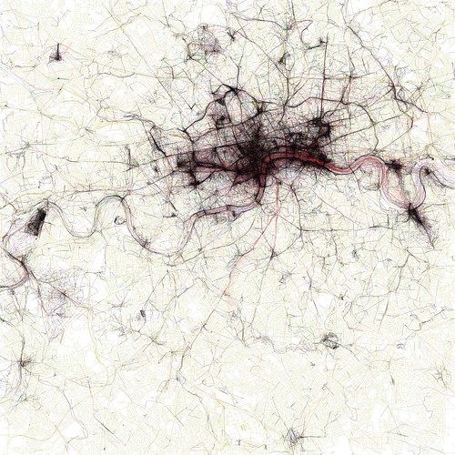
When these two things meet or collide the results can be spectacularly compelling and produce, unintentionally ... art? Look at the image below ... filigree lace work? Crochet for the deranged of mind? Silk for the sociopath? Macrame for the mad? Sadly none of the above.

The Geotaggers' World Atlas #2: London

It's instead an image from the Geotagger's World Atlas but it's still unintentionally beautiful.