Posts tagged as "map"

A Map Of The World In One Million Lego Bricks

Imagine for one moment that someone gave you in excess of a million lego bricks and four thousand lego building plates. Imagine also that you had around three week's worth of spare time.

What would you build?

To my mind, the first thing that should spring to mind is a massive map of the world. You've got enough bricks so making a map around 12 by 5 meters should do the trick.

A 1 Million Piece Lego Map Of The World.

Oddly enough, that's exactly what members of the public did on London's Southbank during the London 2012 Olympic Games.

Looking From San Francisco To London. In Lego.

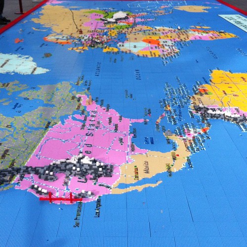
If you want to see it for yourself, head over to the terraces outside the Royal Festival Hall but you'll have to hurry. The map will only be around until August 26th.

You Are Here; Map Wallpaper For Your Laptop

I've recently been guilty of using the term map wallpaper as a mild form of pejorative; meaning maps that are great for showing geographical context but which don't really show anything else. I'm also guilty of overusing the phrase eye candy; something which is eye catching but ultimately superficial.

Then along comes an eye candy map wallpaper app for my MacBook Pro and all pejoratives are instantly replaced with superlatives. Yes, this is eye candy. Yes, this is map wallpaper. But in this case the geographical context is spot on and it's definitely eye catching without being superficial in any way.

Mapstraction, Maps and Me

It's been a while since my last blog post; my day job at Nokia has been taking up almost all of my time and what little time has been left has been spent with my family. But in between day job and family time there's evenings spent in a hotel room and hours spent on a plane, mainly between London's Heathrow and Berlin's Tegel airports. It's in these periods of time that a combination of my MacBook Pro, running a combo of Apache/MySQL/PHP with MAMP and TextMate has allowed me to rediscover the pleasure of what I used to do for my day job before Yahoo! and before Nokia ... and that's to write code.

Mapping The Might Have Been

The moment you make a map there's a fairly good chance that it will be out of date. There's nothing wrong with this; anyone who works in the cartography or mapping fields will tell you that one of the biggest challenges in making maps is not making the map, it's keeping it up to date once it's made. Geography is constantly moving, changing, flowing thing.

One of the most fascinating aspects of old maps is not so much looking at what's changed since they were made, though that is fascinating enough, but of what might have been but then never was.

Regular readers of this blog may have worked out that out of all the maps there are, my favourite is the London Underground Tube map. A browse through the London Tube Map Archive shows just how much the Tube network has expanded and contracted over the years and how stations have changed not only in name but sometimes in position as well. But some of these maps also show what was planned but which was never realised; as Trent Reznor once put it "all the what abouts, the might have and could have beens". Take a look at this map of the network from 1938.

After Neogeography, Here Comes Neocartography

First there was neogeography, a convenient label for the practice of geography outside of the formally accepted geographical disciplines. A convenient label, but one which caused some controversy and mud slinging with the aforementioned formally accepted disciplines being labelled paleogeography and with a strong emphasis on the pejorative.

So it seems almost inevitable that we now have a proposal from the International Cartographic Association to form a commission on neocartography, looking into the practise of making maps outside of the formally accepted cartography profession.

Putting The Tube On The Grid; A Geeked Out Cartographical Recipe

Here's a simple, cut-out-and-keep recipe for making a very geeked out update on a cartographical classic. First, take a classic and iconic map which appeals to both the map geek in you as well as the Tube geek in you. Harry Beck's 1931 reworking of the map of the London Underground system will do nicely.

Old School Tube

Next, take a classic, 1980's movie which appeals to both the scifi fan and the computer nerd in you and classifies as a guilty pleasure as an added bonus. Disney's 1981 Tron fits the bill here.

Tron Poster

Add the ingredients, mix well and serve. The end results might just look like Kevin Flynn's version of the London Underground network on The Grid.

Tron - Tube Map

To paraphrase Kevin Flynn (the Tron character not the artist) ... "Who's that guy?", "That's Tron. He fights for the Tube Users".

Photo Credits: thehutch on Flickr and Kevin Flynn on Deviant Art.

The Death Of The Map Has Been Greatly Exaggerated

Just like RSS, the death of the map has been widely predicted, but to paraphrase Mark Twain, the death of both have been greatly exaggerated. Produce an online data set with some form of geospatial or location content and someone, somewhere, will produce a map of it.

Sometimes the resultant map leaves a lot to be desired, such as the recent UK government's attempts to map crime across the country. But sometimes, the map shows something much more interesting, topical and relevent, such as the use of social media in the recent events in Egypt.

Hypercities have produced a series of maps "for traveling back in time to explore the historical layers of city spaces in an interactive, hypermedia environment" and have now produced a map showing the Tweet stream during and after the stepping down of Egyptian government.

Lachrymose Cartography

After yesterday's admittedly bleak look at how not to use a map, I thought it worthwhile to look at a far more upbeat use of a map. This particular gem has been doing the rounds for a long long time, but I've no idea where it originated from (if you know, then please let me know in the comments).

As a map it's a fairly simple affair, inspired by Andrew Lloyd Webber's and Tim Rice's 1978 musical Evita, showing which countries should and which countries shouldn't cry for you.

So now you know.

Just Because You Can Put Something On A Map ...

A quick review through last year's posts shows a fairly consistent theme of mine; that despite the absence of the map in many of today's location services sometimes the map is the best way of simply presenting information in a readily accessible and understandable form.

But a map is much more than just a visualisation for overlaying data upon, a map says as much about the fears, hopes, dreams and prejudices of its target audience as it does about the relationship of places on the surface of the Earth.

Remapping The World By Population Size

From the department of cartographical curiosities comes this wonder; a map of the world but with the countries changed so that their population size corresponds to the size of each country. It's a map of the world; but not as we know it and has cropped up in several places online, including Frank Jacob's excellent Strange Maps blog.

World Map By Population Size

In this new world order, the United Kingdom now sits, landlocked, in the middle of Africa, where the Republic of Niger is usually found and Germany has migrated in a South Easterly direction and now sits where you'd expect to find Saudi Arabia. The map also notes the interesting coincidences that the United States, Yemen, Brazil and Ireland don't actually move and correspond precisely to their place in the population ranking.

Photo Credits: JPALMZ (original source unknown).