Posts tagged as "tube"

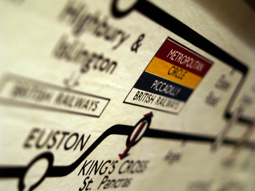
The London Tube Map Made (Too) Simple

This is post number six in the ongoing #mapgasm series of posts on maps found on the interwebs that I like. Yes, it's another map. Yes, it's another Tube map. I make no apologies for this.

A simple map is often a good map. Cutting away cartographical clutter can reveal the heart of what a map is trying to show. But sometimes you can maybe take the map pruning just a little bit too far. Take the map of the London Underground; surely one of the simplest and more effective maps there is. Surely there's not much scope for making it any simpler?

Map Nature Or Map Nurture; Are Map Addicts Born Or Made?

I've said it before, many times, but I'm a 100% un-reconstructed map addict and make no apology for it. I've said this in posts I've written on this blog as well as using it as part of my introduction for talks at conferences. This post is a slightly more long winded version of why I am the map addict that I am.

I grew up in the suburbs of London. For as long as I can remember, every week day morning my father picked up his briefcase and walked to the local British Rail station (for this was way before the privatisation of the British rail network) and went to the fantastical place, to a child's mind at least, called Central London where he worked. He went there on a train. Which was amazing and wonderful to me at the time. I knew he worked in Central London because he had a book of maps of all the streets in Central London. It was old, dog-eared and probably out of date but it made the journey to and from work with him every day and I used to look at it in the evenings, after he'd come home for the day. This mystical and wondrous book was called the London A-Z. It looked something like this.

The Map Of The World According To The London Underground

Yes, it's another map. Yes, it's another map of the London Tube system. But wait ... something's not quite right.

Surely the Piccadilly Line ends at Uxbridge, Heathrow Airport and Cockfosters and not at Seattle, Buenos Aires and St. Petersburg? Doesn't the Northern Line run from Edgeware and High Barnet to Morden and not from Helsinki to Mumbai?

Maybe if the London Underground did take over the world, including 3 tunnels across the Atlantic Ocean, this is what the Tube Map might look like.

World Metro Map by Mark Ovenden

Photo Credits: Annie Mole on Flickr.

The Olympic Tube Map

Not all maps are created equal. I've always had a soft spot for maps of the London Underground network ever since I saw one on the back of an old London A-Z street map far too many years ago.

In case you hadn't noticed, London hosted the 2012 Olympic Games a few weeks ago so what could be more natural than a map of the Tube with famous Olympic athletes in the place of the more familiar and geographically correct station names. Maybe Chris Boardman instead of Swiss Cottage, Victoria Pendleton instead of St. John's Wood or Daley Thompson in place of Baker Street?

Hop over to the Transport for London web site and for between £3.99 and £49.00, the Olympic Legends Tube Map can be yours. I certainly want one. Huge amounts of kudos go to my darling wife for spotting this in the first place.

Making Maps Underground

Warning. This post contains a sweeping generalisation. Yes, I know that Places are not just part of today's digital maps; see the James Fee and Tyler Bell hangout The One Where Tyler Bell Defines Big Data as a proof point. But for the sake of this post, just assume that Places and maps are synonymous.

It's never been easier to make a map. Correction. It's never been easier to contribute to a map. Today we seem to be makingcontributing to maps everywhere, even underground, or should I say Underground?

To makecontribute to a map, you used to have to be a professional map maker, with easy access to an arsenal of surveying or an industrial grade GPS.

Mapping The Might Have Been

The moment you make a map there's a fairly good chance that it will be out of date. There's nothing wrong with this; anyone who works in the cartography or mapping fields will tell you that one of the biggest challenges in making maps is not making the map, it's keeping it up to date once it's made. Geography is constantly moving, changing, flowing thing.

One of the most fascinating aspects of old maps is not so much looking at what's changed since they were made, though that is fascinating enough, but of what might have been but then never was.

Regular readers of this blog may have worked out that out of all the maps there are, my favourite is the London Underground Tube map. A browse through the London Tube Map Archive shows just how much the Tube network has expanded and contracted over the years and how stations have changed not only in name but sometimes in position as well. But some of these maps also show what was planned but which was never realised; as Trent Reznor once put it "all the what abouts, the might have and could have beens". Take a look at this map of the network from 1938.

Putting The Tube On The Grid; A Geeked Out Cartographical Recipe

Here's a simple, cut-out-and-keep recipe for making a very geeked out update on a cartographical classic. First, take a classic and iconic map which appeals to both the map geek in you as well as the Tube geek in you. Harry Beck's 1931 reworking of the map of the London Underground system will do nicely.

Old School Tube

Next, take a classic, 1980's movie which appeals to both the scifi fan and the computer nerd in you and classifies as a guilty pleasure as an added bonus. Disney's 1981 Tron fits the bill here.

Tron Poster

Add the ingredients, mix well and serve. The end results might just look like Kevin Flynn's version of the London Underground network on The Grid.

Tron - Tube Map

To paraphrase Kevin Flynn (the Tron character not the artist) ... "Who's that guy?", "That's Tron. He fights for the Tube Users".

Photo Credits: thehutch on Flickr and Kevin Flynn on Deviant Art.

Crowd Sourcing The London Underground Tube Strike

From as early as 9.00 PM tonight, the London Underground network will be hit by a strike called by the RMT and TSSA unions. Again.

For Londoners this will probably come as no surprise, but this time around, the BBC are crowd-sourcing a map of station closures, services affected and the knock on impact to other forms of London public transport, using publicly submitted reports and media in addition to reporters on the street. It seems natural enough that this will be visualised on a map and in tonight's BBC London News, it was plainly evident that the BBC are using OpenStreetMap as the underlying map tiles for the visualisation.

You can see a snapshot of how the map looks, taken a few minutes ago; head over to the London Tube Strike Map for more updates as the strike starts to affect London.

Service Suspended On The London Underground (API)

If you build it they will come. Or to put it another way, sometimes demand outstrips supply. After the phenomenal success of the Transport For London Tube API, the London Datastore blog sadly notes:

Owing to overwhelming demand by apps that use the service, the London Underground feed has had to be temporarily suspended. We hope to restore the service as soon as possible but this may take some days. We will keep everyone informed of progress towards a resolution.

In the meantime, if you want to see how it does looks when the API is up and running there's a video clip of Matthew Somerville's recent Science Day hack visualisation over on my Flickr photo and video stream.

No Victoria line service after 2000 tonight Photo Credits: Martin Deutch on Flickr.

Where's My Tube Train? Ah, There's My Tube Train

Back in December of 2009, I wrote about Paul Clarke trying to solve the problem of where's my train; that there must be a definitive, raw source of real-time (train) information and that

I assert that train operators know where their assets are; it would be irresponsible if they didn't

Whilst the plethora of train operators that fragmented from the ashes of the old British Rail network haven't answered this challenge yet, Transport for London has, opening up just such data as part of the London Datastore API. In today's age of talented web mashup developers, if you release an API people will build things with it if the information is useful and interesting and that's just what Matthew Somerville of MySociety did at the recent Science Hack Day ... a (near) realtime map of the London Underground showing the movement of trains of all of the Tube lines. A screen grab wouldn't do it justice and it takes a while to load, so a video grab might help here.