Posts tagged as "visualisation"

The Changing Map Of Europe's Boundaries

The boundaries of Europe's constituent countries have changed a lot in my lifetime. Some countries don't exist anymore whilst others have come into existence. But it takes a map visualisation to make you realise just how much the map of Europe has changed.

Actually, it takes two map visualisations. The first, courtesy of the BBC, dates from 2005 and covers the years between 1900 and 1994. Starting wit Imperial Europe and fast forwarding though two world wars, plus the Cold War and taking in the collapse of the Communist Bloc and the expansion of the European Union.
Are You A Map Maker, A Map Builder, A Map Scripter Or A Map Creator?

These days there's so many ways that you can make a map. You can use a Javascript Maps API and put push pins on a slippy map. You can take vector data, transform it into JSON and use a different Javascript API to make an SVG map. You can load data from pretty much any source into either a desktop GIS or a visualisation tool. The possibilities are endless; maybe more endless than you might first assume.

Thierry Gregorius has helpfully put together a cut out and keep guide to which type of mapper you are.

The Great British Map; Or Great Britain vs. The United Kingdom vs. The British Isles

Last night I made another map. It tries to answer some of more perplexing and confusing facets of the geography surrounding the world's 9th largest island. I mean of course Great Britain. No, wait. I mean the United Kingdom. No, wait. I mean Britain. Or do I mean England? See, it's confusing.

  • So if the ISO 3166-2 code is GBR, how come the country is called the United Kingdom?
  • But if England is a country and the United Kingdom is a country, how come England is part of the United Kingdom?
  • What about Scotland, Wales and Northern Ireland?

This isn't the first time I've covered this topic. The first time was for a post on the now defunct Yahoo! Geo Technologies blog entitled UK Addressing, The Non Golden Rules Of Geo Or Help! My Country Doesn't Exist. The ygeoblog.com domain is now long gone and redirects to the Yahoo! corporate blog but I was able to reproduce this post here and it's also captured in the Internet Archive's WayBackMachine. The second time was when I made a variation of The Great British Venn Diagram. But this is the first time (though probably not the last) that I've used a map, which is odd as this is something that's tailor-made for a map.

You Were Here; Mapping The Places I've Been To According To Foursquare

Over the weekend I made another map. While I don't think for one moment this one will be as wildly popular as my last map was, this one is just as satisfying and a whole lot more personal.

At 8.01 PM on the 11th. of October 2009 I checked into Sushi Tomi in Mountain View, California. This was my very first Foursquare check-in. Since then I've checked-in on this particular location based service a further 12,394 times. Each check-in has been at a place I've visited. As this is a location based service, each check-in comes with a longitude and latitude.

This sounded to me like an ideal candidate for a map. But how to go about making one?

Mapping Meteor Strikes; There's A Lot More Than You'd Think

Last week's 10,00 ton and 55 feet's worth of meteor that exploded over and hit the Russian city of Chelyabinsk in the Urals made several thoughts go through my mind. In this order.

  1. I feel for the 1200 people who were hurt and injured
  2. Thank goodness it didn't happen where I live
  3. With all the asteroids and smaller pieces of rock zooming over our head, this has got to have happened before, hasn't it?

Maps, Maps And MOAR Maps At The Society Of Cartographers And Expedia

Updated September 13th. 2012 with embedded YouTube video.

Wednesday September 5th. 2012 was a day of maps. To be precise, it was a day of maps, maps and MOAR maps. Two events, two talks, back to back. Packed choc-a-bloc full of maps. I also cheated slightly.

Firstly there was the International Cartographical Association's first session of the newly formed Commission on Neocartography. Cartography, neocartography, maps; what is there not to like? I'd previously spoken at the UK's Society of Cartographer's annual conference so it was great to be asked by Steve Chilton, SoC and Neocartography chair, to speak at the Neocartography Commission.

The Death Of The Map Has Been Greatly Exaggerated

Just like RSS, the death of the map has been widely predicted, but to paraphrase Mark Twain, the death of both have been greatly exaggerated. Produce an online data set with some form of geospatial or location content and someone, somewhere, will produce a map of it.

Sometimes the resultant map leaves a lot to be desired, such as the recent UK government's attempts to map crime across the country. But sometimes, the map shows something much more interesting, topical and relevent, such as the use of social media in the recent events in Egypt.

Hypercities have produced a series of maps "for traveling back in time to explore the historical layers of city spaces in an interactive, hypermedia environment" and have now produced a map showing the Tweet stream during and after the stepping down of Egyptian government.

Visualising Twitter's Geotagged Tweets

You might have noticed but I'm a reasonably big Twitter user. Actually, I should be more precise. I'm a reasonably big Twitter API user ... I tend to use Tweetdeck on my mobile devices and on my laptop. I very rarely use Twitter on the web, and so I've only just noticed how Twitter are handling the display of geotagged Tweets. Take a look below and you'll see that on the accompanying map that they're rolling up from the point of the geocode to the nearest administrative geographic entity and highlighting this in a rather fetching shade of transparent red.

Where's My Tube Train? Ah, There's My Tube Train

Back in December of 2009, I wrote about Paul Clarke trying to solve the problem of where's my train; that there must be a definitive, raw source of real-time (train) information and that

I assert that train operators know where their assets are; it would be irresponsible if they didn't

Whilst the plethora of train operators that fragmented from the ashes of the old British Rail network haven't answered this challenge yet, Transport for London has, opening up just such data as part of the London Datastore API. In today's age of talented web mashup developers, if you release an API people will build things with it if the information is useful and interesting and that's just what Matthew Somerville of MySociety did at the recent Science Hack Day ... a (near) realtime map of the London Underground showing the movement of trains of all of the Tube lines. A screen grab wouldn't do it justice and it takes a while to load, so a video grab might help here.

Visualising Tag Clouds

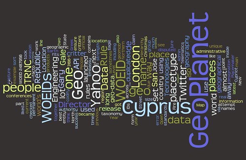
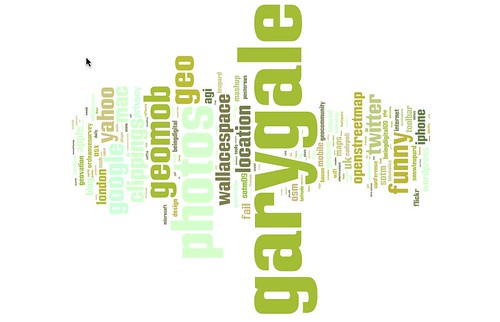
If you haven't played with Wordle yet, I strongly suggest you point your browser of choice there right now and see what gorgeous visualisations of tags it comes up with. This is my delicious tag cloud ...

Playing with tag clouds: https://delicious.com/vicchi

... this is the tag cloud for this blog ...

Playing with tag clouds: /

... and this is the tag cloud for the blog I write for work.

Playing with tag clouds: https://www.ygeoblog.com/

All of which were produced using the default settings, with no tweaking, shows just how varied my personal approach to tagging is and how strongly tied to usage my tags are.