Posts tagged as "cartography"

After The Missing Manual For OpenStreetMap, Here's The Google Map Maker Version

The growth and uptake of today's internet and web allows us to do a lot of things that were previously the preserve of the professional. You can see this in the rise of words which now have citizen prepended to them. We don't just write blog posts, we're citizen journalists. We don't just take photographs, we're citizen photographers. To this list, we can now add citizen cartographer as well.

With the help of OpenStreetMap, HERE's Map Creator (which I work on) and Google's Map Maker, anyone with a modern web browser and an internet connection can now help to make maps where previously there were none and to improve and keep maps up to date, which still remains one of the biggest challenges to map making.

There's already been a book about OpenStreetMap, which I wrote about in April of 2011. As far as I know, no-one's written about HERE's Map Creator but for Google's Map Maker there's Limoke Oscar's Instant Google Map Maker Starter.
2013 - The Year Of The Tangible Map And Return Of The Map As Art

Looking back at the conference talks I gave and the posts I wrote in 2012, two themes are evident.

The first theme is that while there's some utterly gorgeous digital maps being produced these days, such as Stamen's Watercolor, the vast majority of digital maps can't really be classified as art. Despite the ability to style our own maps with relative ease, such as with Carto and MapBox's TileMill, today's maps tend towards the data rich, factual end of the map spectrum. Compare and contrast a regular digital map, on your phone, on your tablet or on a web site in your laptop's browser with a map such as Hemispheriu[m] ab aequinoctiali linea, ad circulu[m] Poli Arctici and you'll see what I mean (and if you don't browse the Norman. B. Leventhal Map Center's Flickr stream you really should).

Making PostgreSQL, PostGIS And A Mac Play Nicely Together

Most things in life are a journey and the destination of this particular journey was to try and create a custom map style that represented the unique features and challenges of Tandale.

Which meant I needed to download and install TileMill, an interactive map design tool.

Which meant I needed to learn Carto, the CSS-like language for map styling.

Which meant I looked for a template project so I didn't have to start from scratch.

Which meant I found OSM Bright.

Which meant I needed to start small and find a map extract of Tanzania to work with.

Which meant I needed to install and configure PostgreSQL and PostGIS on my Mac.

Which brings me to the starting point of the journey and the reason for this post in the first place.

Maps, Maps And MOAR Maps At The Society Of Cartographers And Expedia

Updated September 13th. 2012 with embedded YouTube video.

Wednesday September 5th. 2012 was a day of maps. To be precise, it was a day of maps, maps and MOAR maps. Two events, two talks, back to back. Packed choc-a-bloc full of maps. I also cheated slightly.

Firstly there was the International Cartographical Association's first session of the newly formed Commission on Neocartography. Cartography, neocartography, maps; what is there not to like? I'd previously spoken at the UK's Society of Cartographer's annual conference so it was great to be asked by Steve Chilton, SoC and Neocartography chair, to speak at the Neocartography Commission.

The Missing Manual For OpenStreetMap?

The first computer I used at work was powerful for its day (though pitifully underpowered compared to the phone that's sitting in my pocket at the moment) but was somewhat unfriendly by today's standards. You sat down at a terminal (not a PC, they hadn't been invented) and were presented with a command line prompt that said "Username:", pass that barrier to entry and it said "Password:". Armed with the right combination of username and password you would be rewarded with a flashing cursor preceded by a dollar sign as a prompt ... $. If you wanted help you couldn't browse the web (it hadn't been invented) nor ask in a mailing list (the Internet was in its early days and you probably didn't have access). Instead you consulted the big, heavy, ring bound, bright orange documentation set; these were the heady days of DEC and VAX/VMS.

The computer I'm writing this on still needs a username and password but is easy to use, graphical, intuitive and comes with multiple web sites, discussion and documentation sites and mailing lists to ask questions in. But to get the most of today's computers you still need a book sometimes, which is why David Pogue's Mac OS X: The Missing Manual is still one of the most well thumbed books I have, 8 years and multiple editions later. There's a version for Windows too.

So what does this have to do with OpenStreetMap? Bear with me ... there are parallels to be drawn.

After Neogeography, Here Comes Neocartography

First there was neogeography, a convenient label for the practice of geography outside of the formally accepted geographical disciplines. A convenient label, but one which caused some controversy and mud slinging with the aforementioned formally accepted disciplines being labelled paleogeography and with a strong emphasis on the pejorative.

So it seems almost inevitable that we now have a proposal from the International Cartographic Association to form a commission on neocartography, looking into the practise of making maps outside of the formally accepted cartography profession.

Putting The Tube On The Grid; A Geeked Out Cartographical Recipe

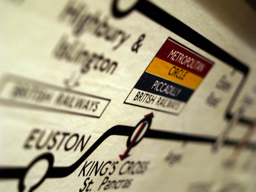
Here's a simple, cut-out-and-keep recipe for making a very geeked out update on a cartographical classic. First, take a classic and iconic map which appeals to both the map geek in you as well as the Tube geek in you. Harry Beck's 1931 reworking of the map of the London Underground system will do nicely.

Old School Tube

Next, take a classic, 1980's movie which appeals to both the scifi fan and the computer nerd in you and classifies as a guilty pleasure as an added bonus. Disney's 1981 Tron fits the bill here.

Tron Poster

Add the ingredients, mix well and serve. The end results might just look like Kevin Flynn's version of the London Underground network on The Grid.

Tron - Tube Map

To paraphrase Kevin Flynn (the Tron character not the artist) ... "Who's that guy?", "That's Tron. He fights for the Tube Users".

Photo Credits: thehutch on Flickr and Kevin Flynn on Deviant Art.

Just Because You Can Put Something On A Map ...

A quick review through last year's posts shows a fairly consistent theme of mine; that despite the absence of the map in many of today's location services sometimes the map is the best way of simply presenting information in a readily accessible and understandable form.

But a map is much more than just a visualisation for overlaying data upon, a map says as much about the fears, hopes, dreams and prejudices of its target audience as it does about the relationship of places on the surface of the Earth.

Remapping The World By Population Size

From the department of cartographical curiosities comes this wonder; a map of the world but with the countries changed so that their population size corresponds to the size of each country. It's a map of the world; but not as we know it and has cropped up in several places online, including Frank Jacob's excellent Strange Maps blog.

World Map By Population Size

In this new world order, the United Kingdom now sits, landlocked, in the middle of Africa, where the Republic of Niger is usually found and Germany has migrated in a South Easterly direction and now sits where you'd expect to find Saudi Arabia. The map also notes the interesting coincidences that the United States, Yemen, Brazil and Ireland don't actually move and correspond precisely to their place in the population ranking.

Photo Credits: JPALMZ (original source unknown).

The Plains Of Awkward Public Family Interactions And The Bay Of Flames

Not content with pointing out the fun you can have with tracking your location, xkcd, the webcomic of romance, sarcasm, math and language has branched out into making maps. The updated map of online communities shows the volume of daily social activity across all of the online world, and not just the high profile ones that get the press coverage.

Click through for the full size versions and loose yourself in the plains of awkward public family interactions, the Bay Of Flames and other geographical wonders.